
Re-imagining a business steeped with over 25 years of heritage presented a challenge for us, the younger generation that has taken over the management of the business. We knew in order to stay current enough for the changing landscape of the events and wedding industry it was imperative we modernise yet maintain the core values and goodwill that our parents built.
We begun by enlisting a designer, ANNA WANG, to come up with a concept for the business and re-design the interiors of our Cabramatta restaurant and wedding venue. The concept for this was “classic yet modern” to create something that has been missing for a long time; a ballroom. You can read about it here. As for the logo and brand, the business consultancy and marketing team of RAGING MONK were commissioned to take our outdated brand, logo and business to the digital age, where everything has to be an experience.
The previous logo served our parents for over 25 years
The history of how this logo was created is long lost but we can guess the design elements reflected that time, when businesses just focused on product and service, without much thought to the image of a brand or brand story. Yes our parents still had to create a name of excellence and goodwill, but it was nothing like today.
It has all the (old) design elements that communicates seafood and water, with a body of water set within a pearl.
How could we maintain our heritage yet be modern?
By making use of the elements that community have recognised for over 25 years and re-creating it in the light of a modern brand and business.
Our Brief
Has a sense of heritage (yet modern), of “generations”, of authentic asian food, celebration of life, of coming together to share experiences and food.
The first iteration of this brief was too seafood-heavy because we focused on our excellence in cooking authentic Chinese seafood banquets. With a business name that includes a monotone colour and a pearl, the natural thing was to gravitate to a clam-shell and pearl mark, throw in some waves and seafood.
This was “safe” and expected – not what we wanted to do especially as we move away from just being known for amazing seafood cooked authentically, to being a restaurant and functions venue with incredible food.
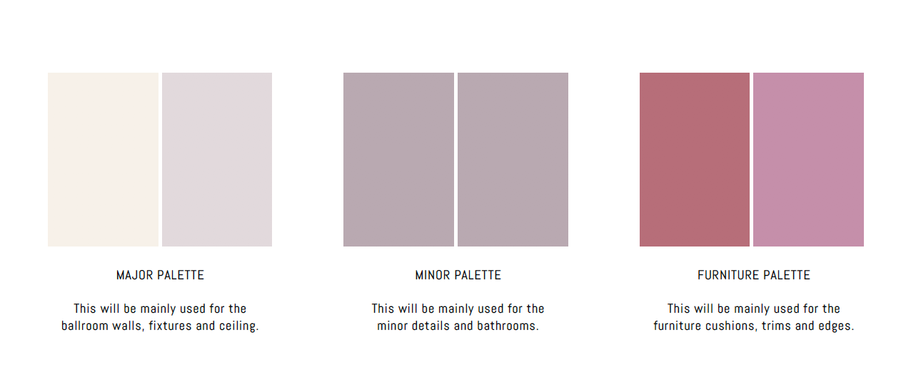
The colour palette of our new look serves as the “brand colours”
It’s soft and feminine, a lot less harsh than the movement towards dark interior designs. We wanted the restaurant and venue to have a softer and light feel.
Introducing the “SILVER PEARL Scale”
The concept of the “SILVER PEARL Scale” was to invoke a sense of seafood and fish while being minimalist and modern.
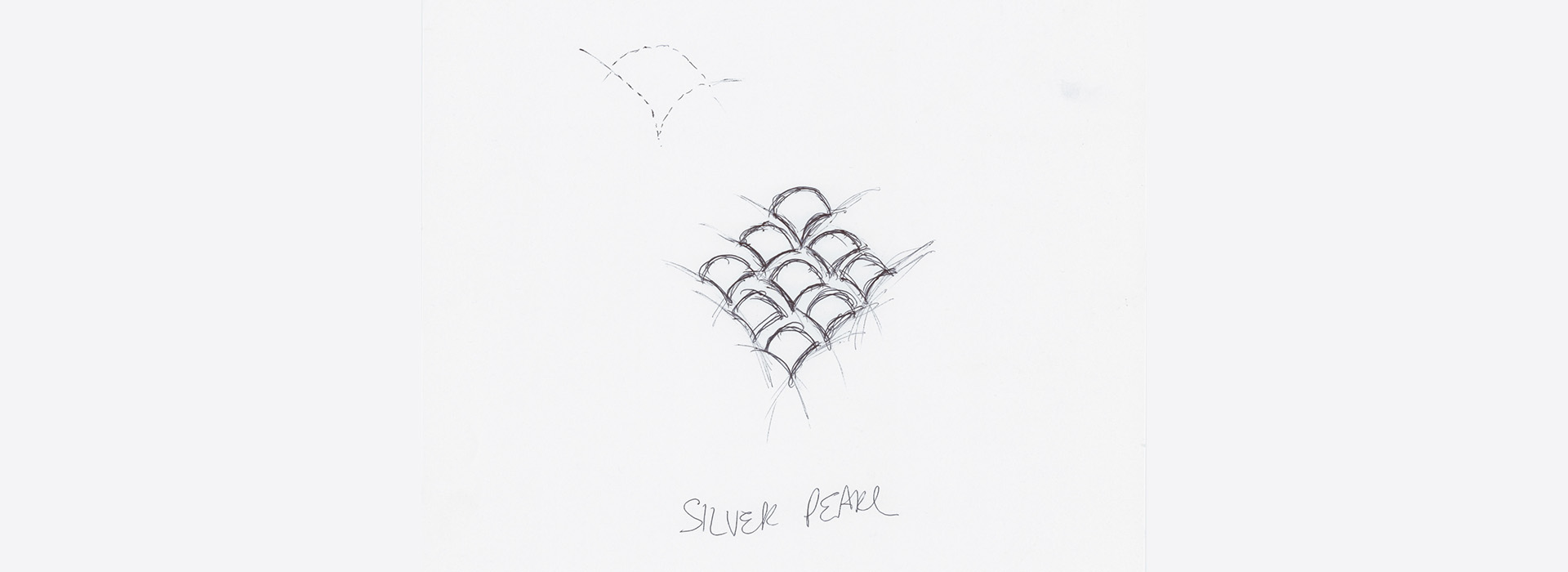
The “scales” were arranged in the shape of a fish, then repeated and formed within a “pearl”
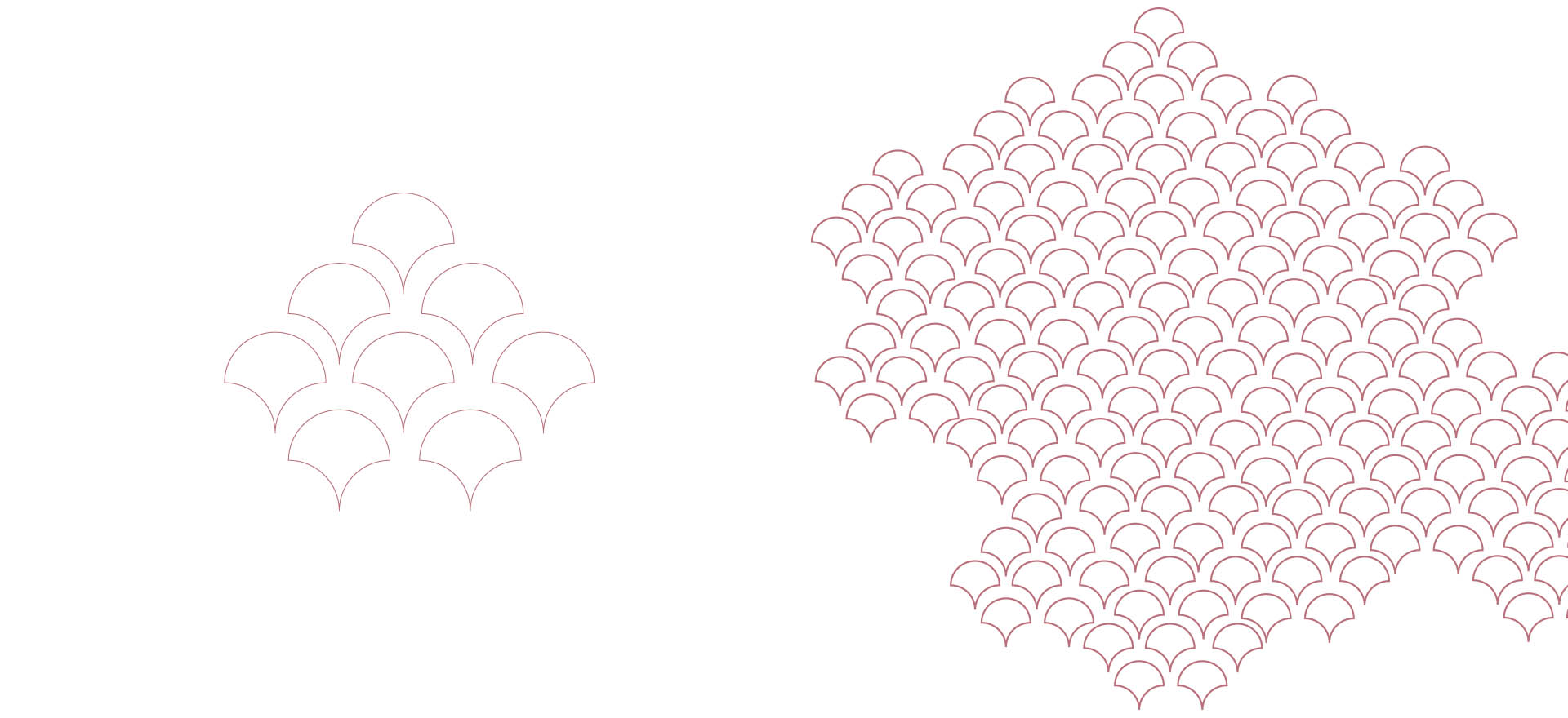
The scales are set within a circle to create the “pearl”


